Moving Data into QGIS
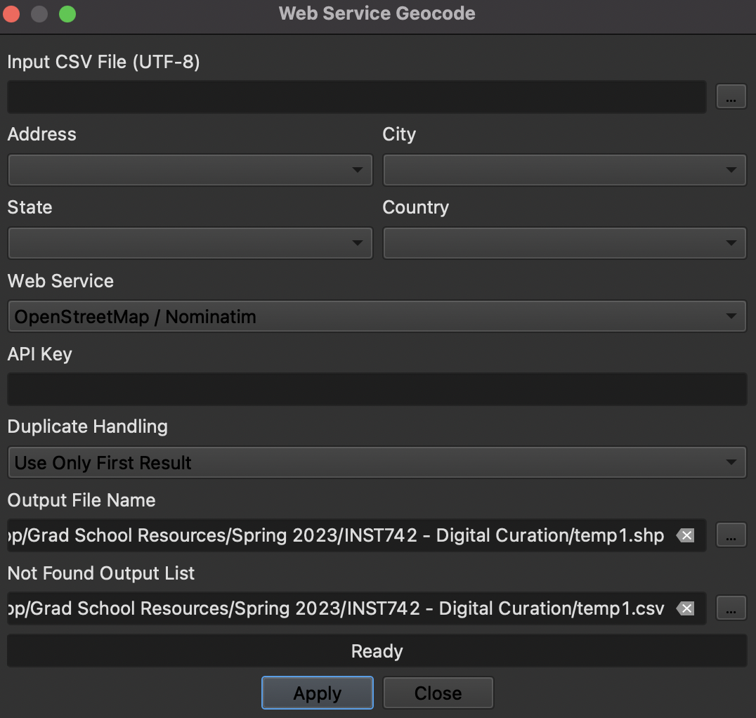
Now that the data had been properly formatted so that a geocoding tool would recognize addresses, I could move on to step 2. After a quick Google search turning up several geocoders that cost a subscription fee, I found out that QGIS has a free geocoding plug-in tool to download called mmQGIS, and decided to make use of it. I plugged the spreadhseet that I pulled from OpenRefine into mmQGIS, and let it get to work pulling latitude and longitude data from the addresses. You can see here in the image of mmQGIS that it helps to have city and state information with the addresses, so that it has a general idea of where to look; for the sake of getting this as accurate as possible, I added these columns into my spreadsheet, with values of Charlotte and NC respectively for each address.
After about 8 hours of running the tool (I am unsure on the total time it took, as I ended up leaving it running overnight and coming back to a final product in the morning), I ended up with the following map plot of address data (zoomed in on downtown Charlotte, as these were the areas with the highest population concentration):
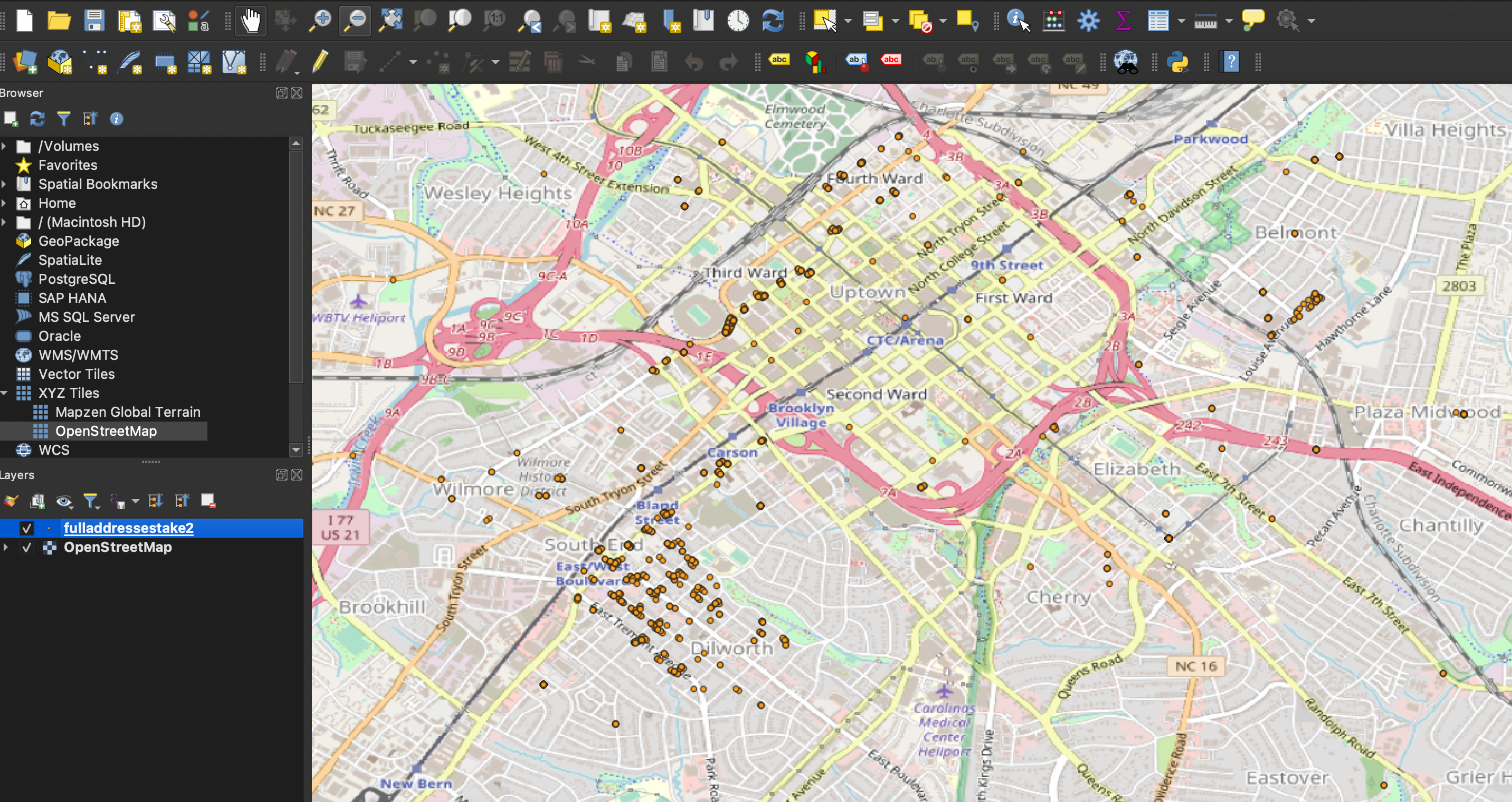
Some important observations to note here:
mmQGIS only successfully geocoded 2,433 of the 12,330 inputted addresses. The reasons for this are unclear; comparing the successfully geocoded addresses with the failed ones yielded no conclusive data, at least to the naked eye. I decided that this would suffice as a sort of "random sampling" method for the sake of this project, but given more time and potentially financial resources, I would have liked to run it through another tool to see if it would return more results to work with.
Using this map plot and the spreadsheet of residents it created, complete with latitude and longitdue coordinates, I began to zero in on the areas I wanted to discover more about. Immediately, the eye is drawn to three main clusters of resident data: the large section in the bottom left of the above image (South End/Dilworth), inside the beltway in the middle of the image (Uptown), and the small group over on the right side of the image (Belmont). Using latitude and longitude boundaries to create pockets of residents, I was able to create three separate spreadsheets of data for comparison in the next step, with around 450 South End/Dilworth residents, 400 Uptown residents, and 150 Belmont residents.